In celebration of the all-new Lovie Awards, we’re highlighting our new media partners, who are Europe’s leading voices in culture, technology and business. We’re thrilled to work with these culture-shaping partners to curate, recognise and showcase the best of the European Internet.
First up is Berlin and London-based design agency Bureau for Visual Affairs (BfVA), whose team is behind the Lovie Awards redesign and new visual identity. We spoke with Simon Piehl, Founder of BfVA and a new Lovie Awards juror about the work he does, how centricity shapes European design, and how they created a new home for people to discover the best of Europe’s Internet.
What are some of the principles that shape the Bureau for Visual Affairs and your work?
As a team, we are very driven by specificity, but also by ergonomics. We care about translating a brand or proposition precisely and recognisably according to its merits and unique selling proposition, but also consider the ergonomics of information, in a sense how it needs to be presented for uptake.
What attracted you to the challenge to design a new identity for the Lovie Awards?
I think core elements of the proposition – the European aspect, the calibre of work, talent and panels involved were exciting to us, as well as of course the team at the Lovies. It was clear that there was a good conversation going on, one we wanted to be a part of, and one we wanted to (help) deliver.
What elements make European design distinct from that of other regions, and how do these influence your work?
There are indeed differences; the use of space, centricity in particular and the way typography is used are quite different. That being said, whilst the design team here at Bureau is very international, the outlook here has always been influenced strongly by the European tradition, especially typographically.
What were the primary sources of inspiration for the rebrand?
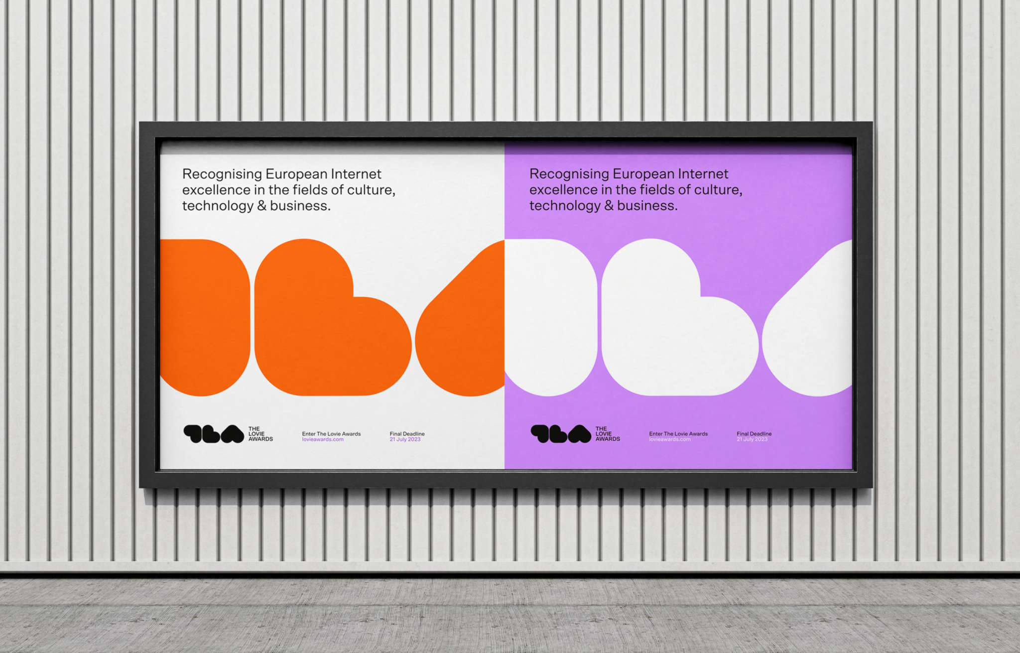
It is fair to say that we looked at a lot of Dutch graphic design — the usual suspects, Wim Crouwel and Karel Martens in particular. We felt their approach to colour, the flat visuality and confidence and positive energy aligned well with the Lovie’s values and principles.
What tools were instrumental in the rebrand of the website?
We use Figma here in the studio, along with a fair bit of dotted A3 paper.
What typefaces are used in the new Lovie identity, and how do they impact the brand identity and user experience?
We introduced SCTO as a brand typeface, which I think speaks well to both the digital nature of the proposition, but also (importantly) brings a huge amount of legibility to the table. It’s the straight companion and counterweight to the energetic and more wilful TLA glyph we drew, so that’s where the energy of the brand comes from.
Did you experience any design challenges in the rebrand?
The delivery needed to take place rather quickly, so in the main the challenges were related to time. Having said that, we felt the communication with Jacqui and the team was always to the point and near instant, so this helped.
How have previous BfVA projects influenced the work with the Lovies?
As a team we have always worked with highly specific, and often very visual and visible clients — we work with WePresent, Damien Hirst, The Albers Foundation and It’s Nice That. We also work with more commercially-led propositions — such as Finisterre, for instance — often brands that are looking to digitally build strong differentiation and a strong perspective, so there was an instant affinity for what the Lovies were looking for.
And how has the Lovies rebrand impacted your larger work?
The team here always had a very strong vision and expertise around implementing an existing brand — visually, tonally but also behaviourally — into digital, rather than delivering the branding work itself (which we more or less shy away from). It will be interesting to see what we get approached for, going forward, but I am certain the project will be influential for the studio.
What is the core aspect of the new Lovie brand that you want the audience to take away? How does the site’s new look impact the brand of The Lovie Awards?
I think we would like audiences to take away a degree of joy and positivity — a focus on what’s good, what is positive and what has had an impact, especially in today’s world. I think the Lovies provide this, and even stands for it. It’s worth celebrating.
Are you creating culture-defining digital work, like our new Lovie partners? Enter the 13th Annual Lovie Awards to align your projects with the European Internet’s cutting edge.